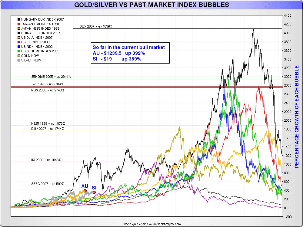
Note that the x-axis does not have time on it because each bubble had a different timelength (some of the bubbles are 20 years, others 5 years). This does skew/stretch the time, but Nick's emphasis with this chart is more on the percentage growth factor rather than how long it took to get to those bubbles.


0 التعليقات:
إرسال تعليق